PHYSICALLY INTERACTIVE INFO-EXPERIENCE DESIGN
a CASE STUDY ASSESSING DESIGN DECISION WITH THE SPECIFIC GOAL OF INCREASING AWARENESS OF AND PARTICIPATION WITH THE mAD hOUSERS NON-PROFIT
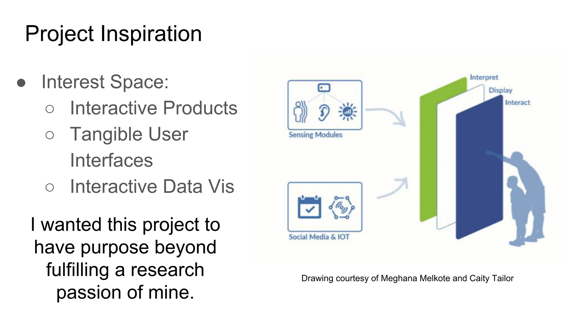
· Over the past two years, I cultivated an interest in projects at the crossroads of interactive products and data visualization. I wanted to find out how to effectively design a user experience in the space of physically interactive information visualizations.
However, knowing I would spend a year working on this project, I wanted to make sure the project had purpose beyond fulfilling my thesis requirement. I decided to add a constraint to the project to find a non-profit doing valuable work in the City for whom I would build the project to help.
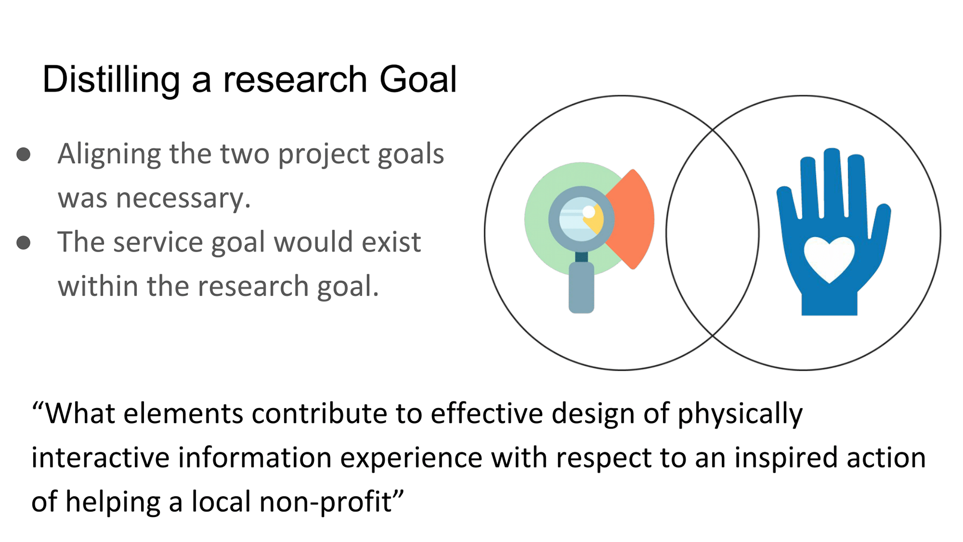
Engaging in a project exploring of design physically interactive information visualization may not mean building the most helpful product for whichever non-profit I worked with.
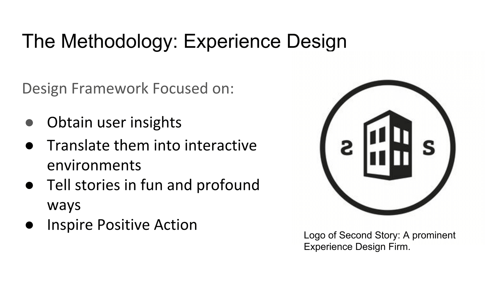
Through the guidance of my adviser, I approached this project using frameworks developed in the field of experience design.
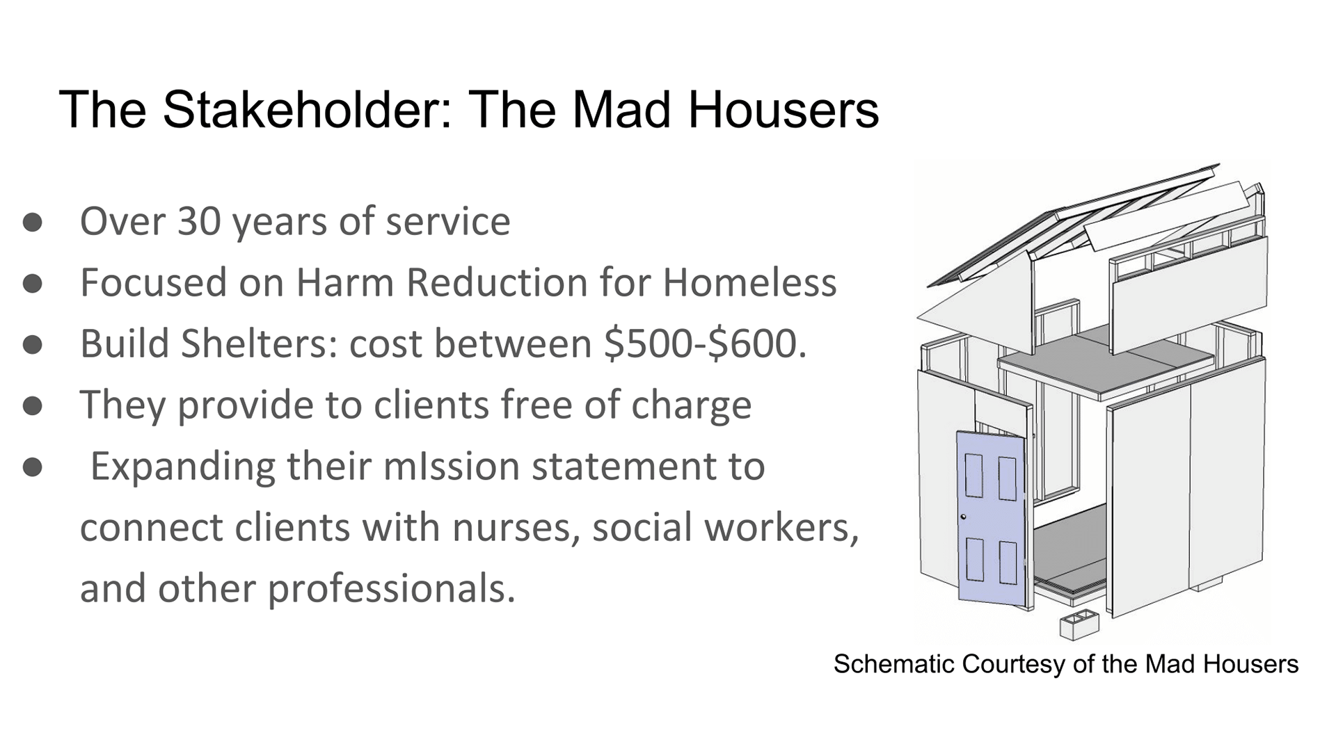
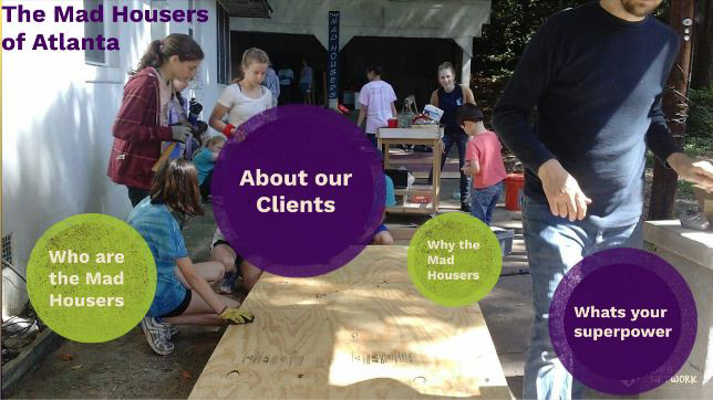
Over the summer I networked with several grassroots movements and was eventually put in touch with the Mad Housers.
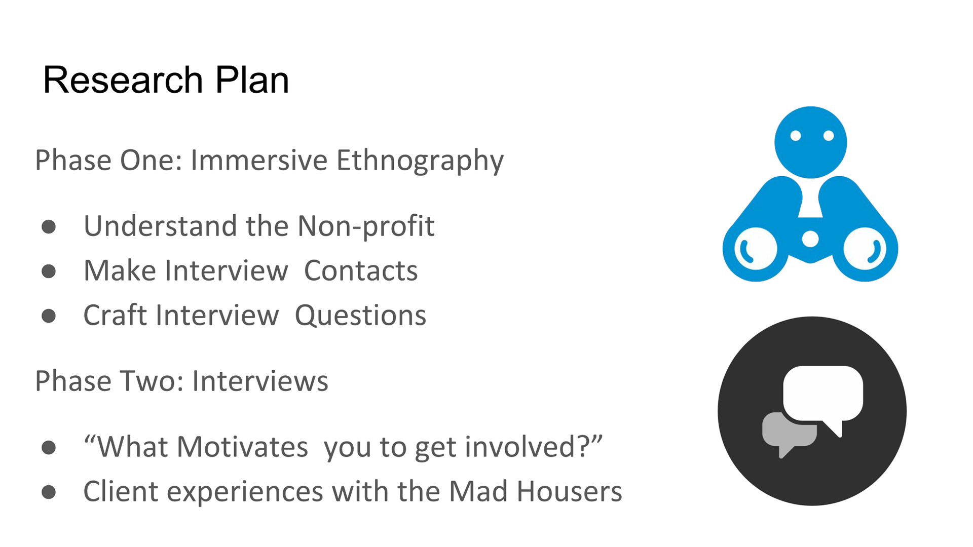
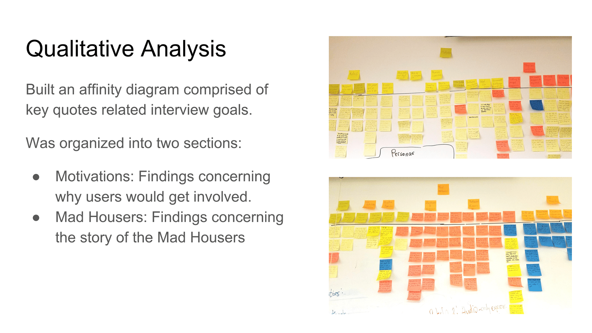
My initial research phase would be immersive and contextual ethnography. Here I would participate in various events held by the Mad Housers to understand more about their work, process, motivation, and challenges.
The secondary phase focused on conducting user interviews with past volunteers and target users, the core goal to distil “What motivates you to get involved”.
Interviews with past volunteers aimed to distill volunteer motivation and gauge the experience.
Speaking with Clients I gathered life and times stories before and after Mad Housers intervention.
Interviewing the president revealed more about the updated mission and organizational needs and difficulties.
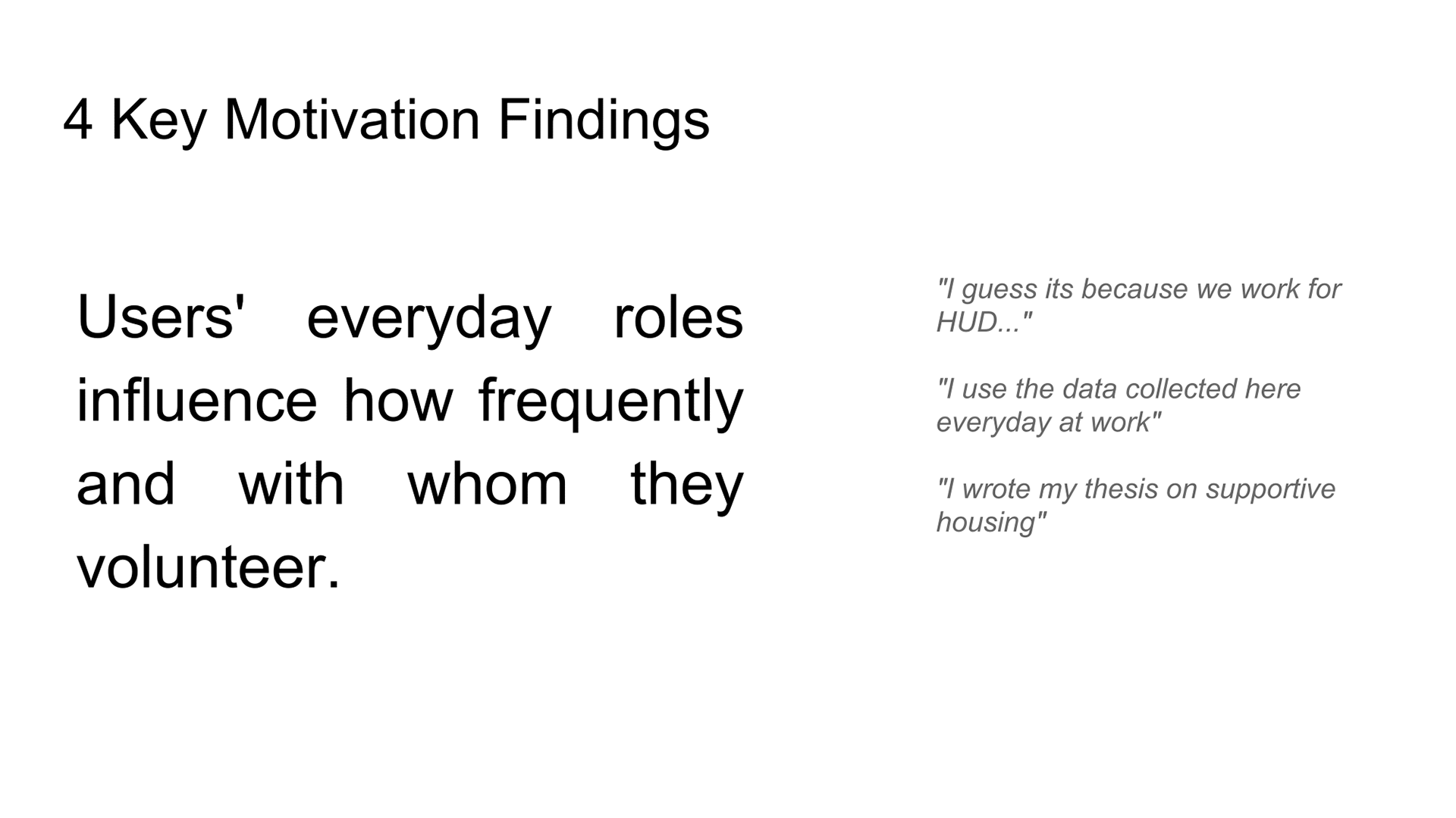
Interviews with the target users distilled motivations for why they would volunteers, have volunteered in the past, and particularly media, events influential to them.
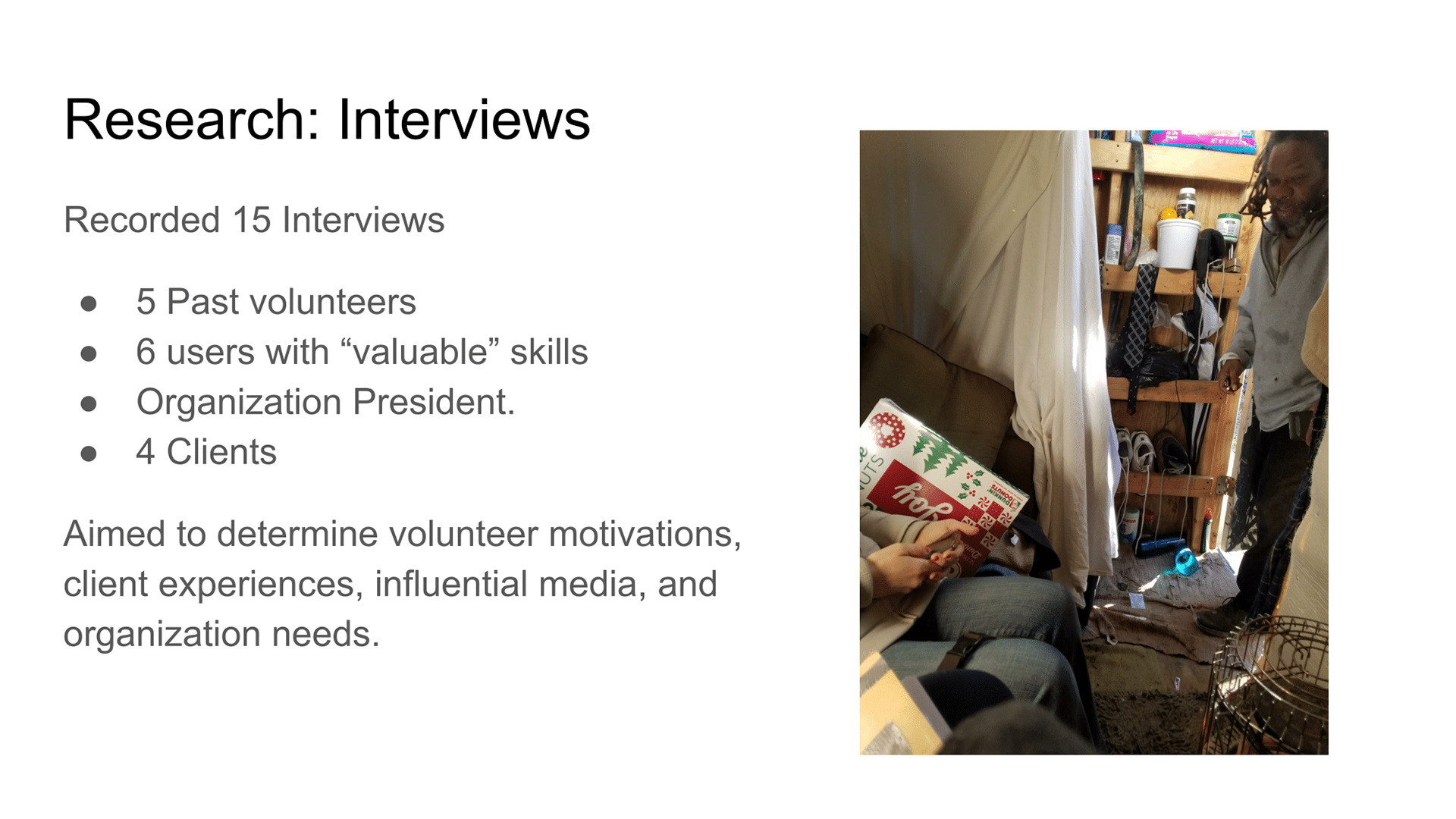
Speaking with Clients I gathered life and times stories before and after Mad Housers intervention.
Interviewing the president revealed more about the updated mission and organizational needs and difficulties.
Interviews with the target users distilled motivations for why they would volunteers, have volunteered in the past, and particularly media, events influential to them.

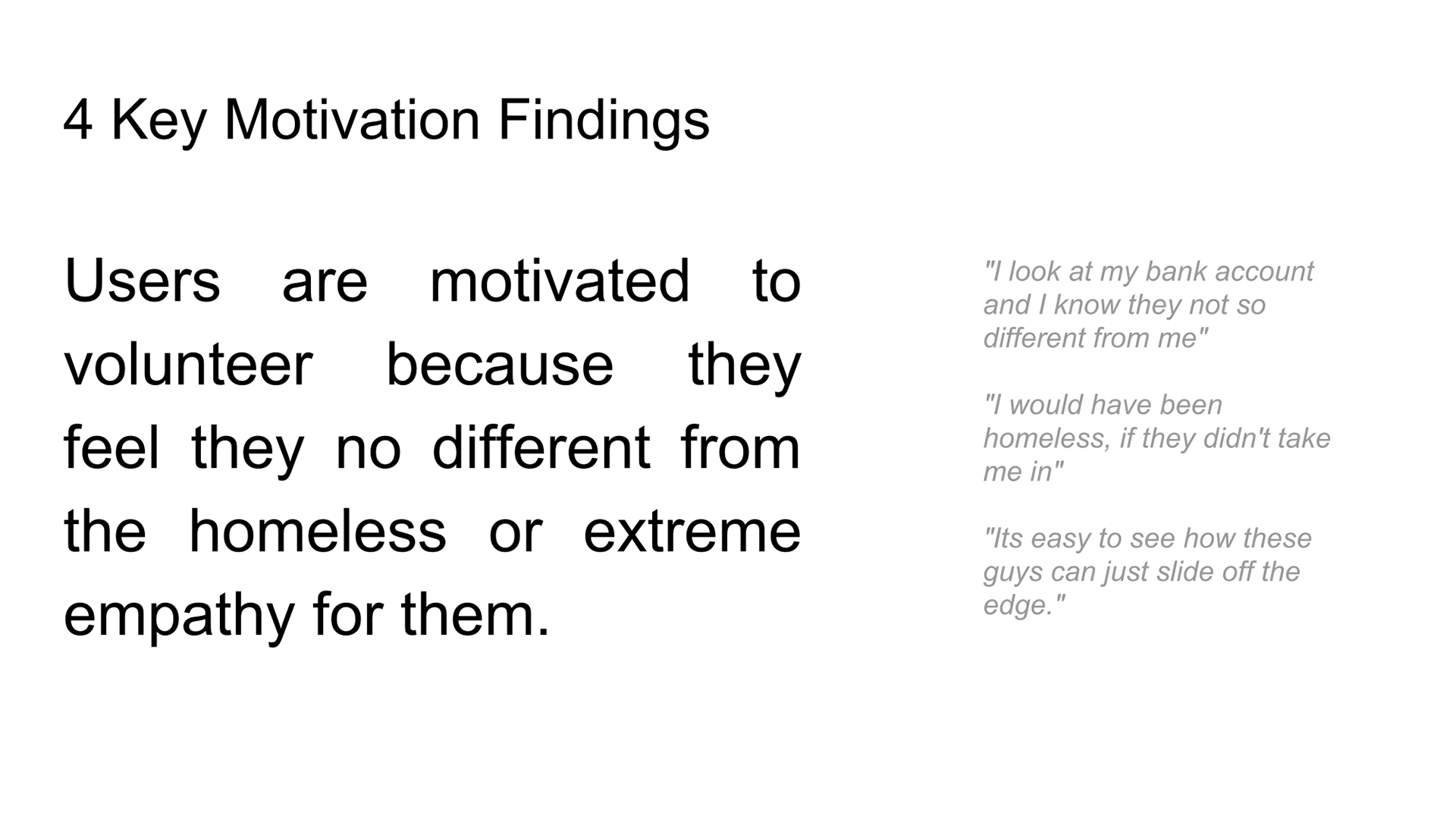

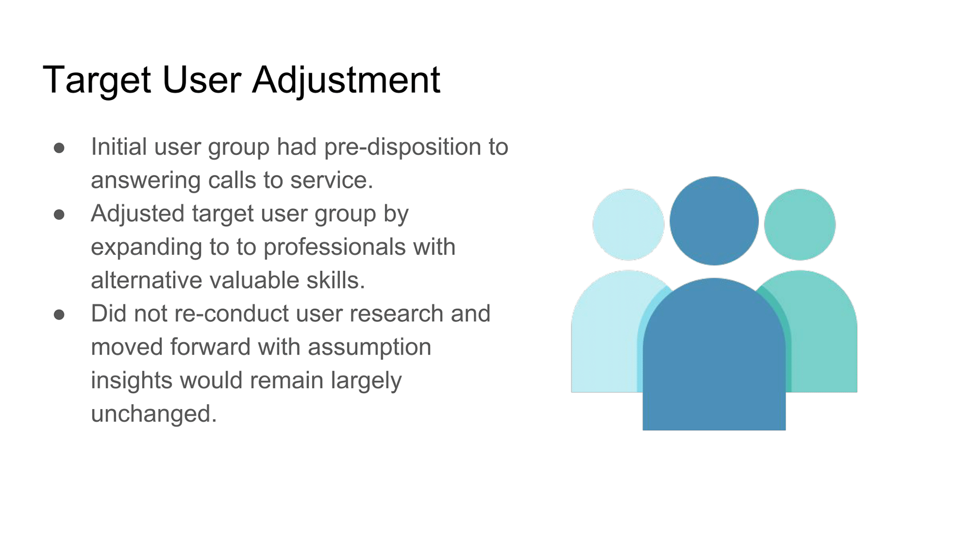
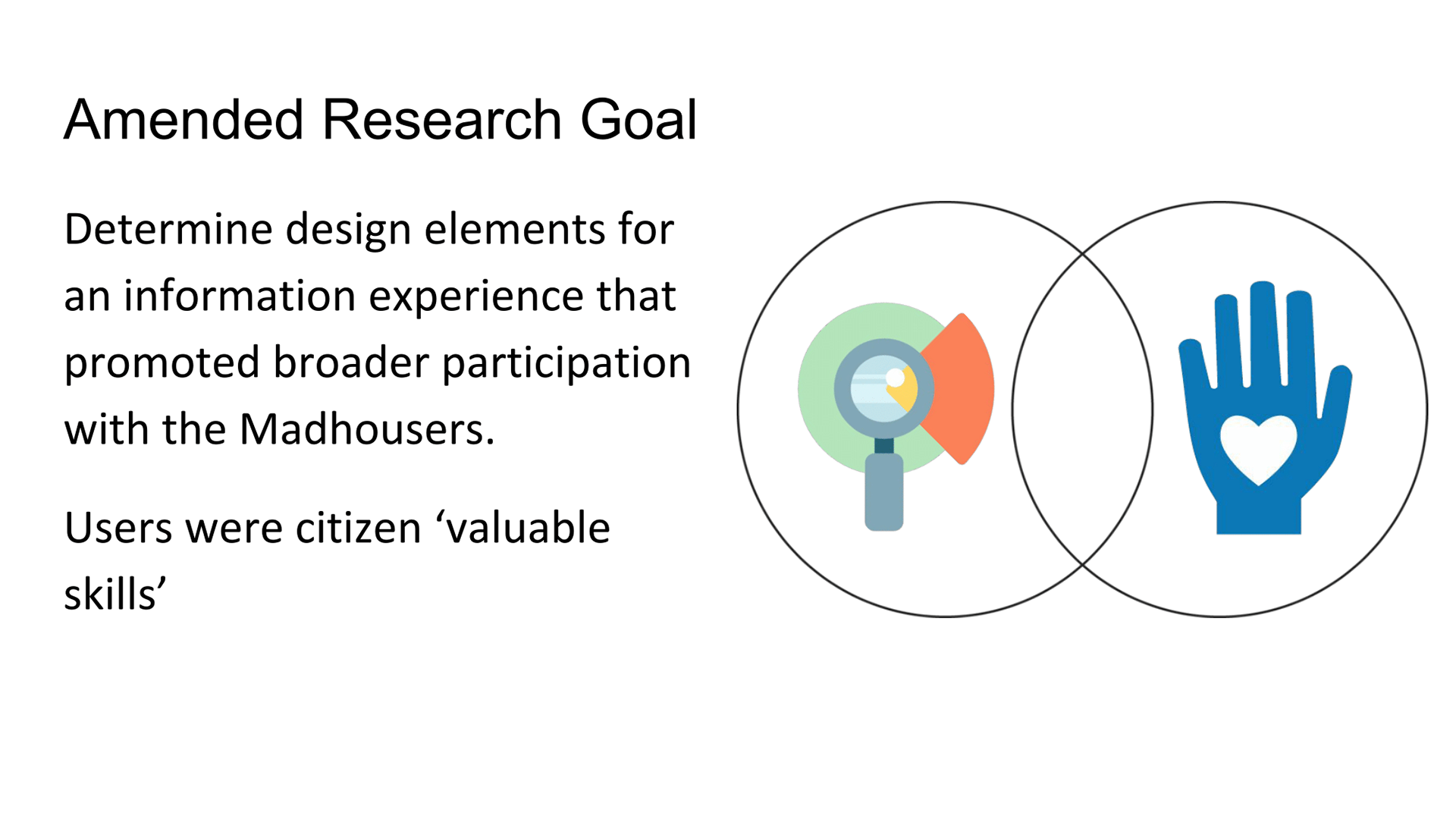
Prior to ideating my design, I made an adjustment to my target user. Initially, I was designing for individuals with ‘valuable’ skills like nurses, social workers. However, after interviewing several, I realized this population had a predisposition to public service. Designing something to promote involvement in that population would not be super effective.
Based on the findings from both research phases and secondary research, I made 4 Info-experience design decisions.

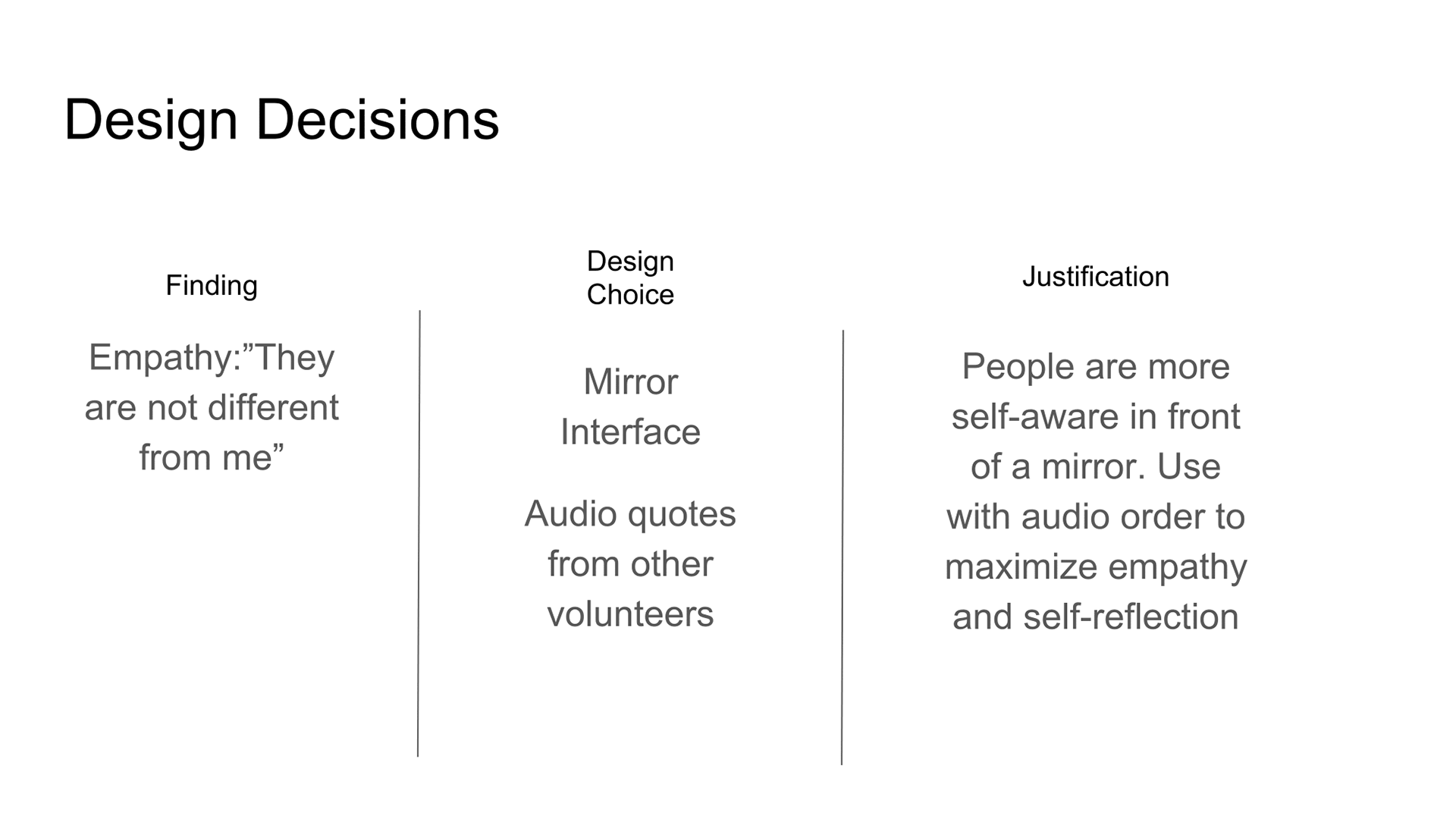
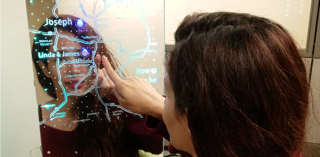
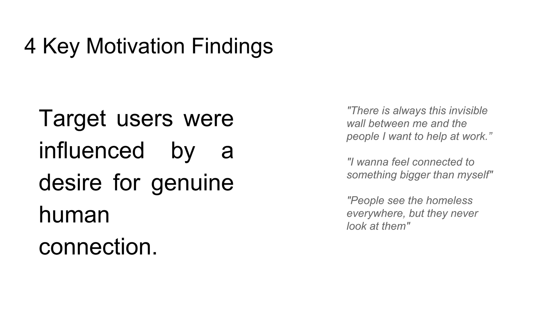
Include a mirror in the experience. This will inspire users to self-aware or at least reflective upon themselves when listening to the stories of The Mad Housers.
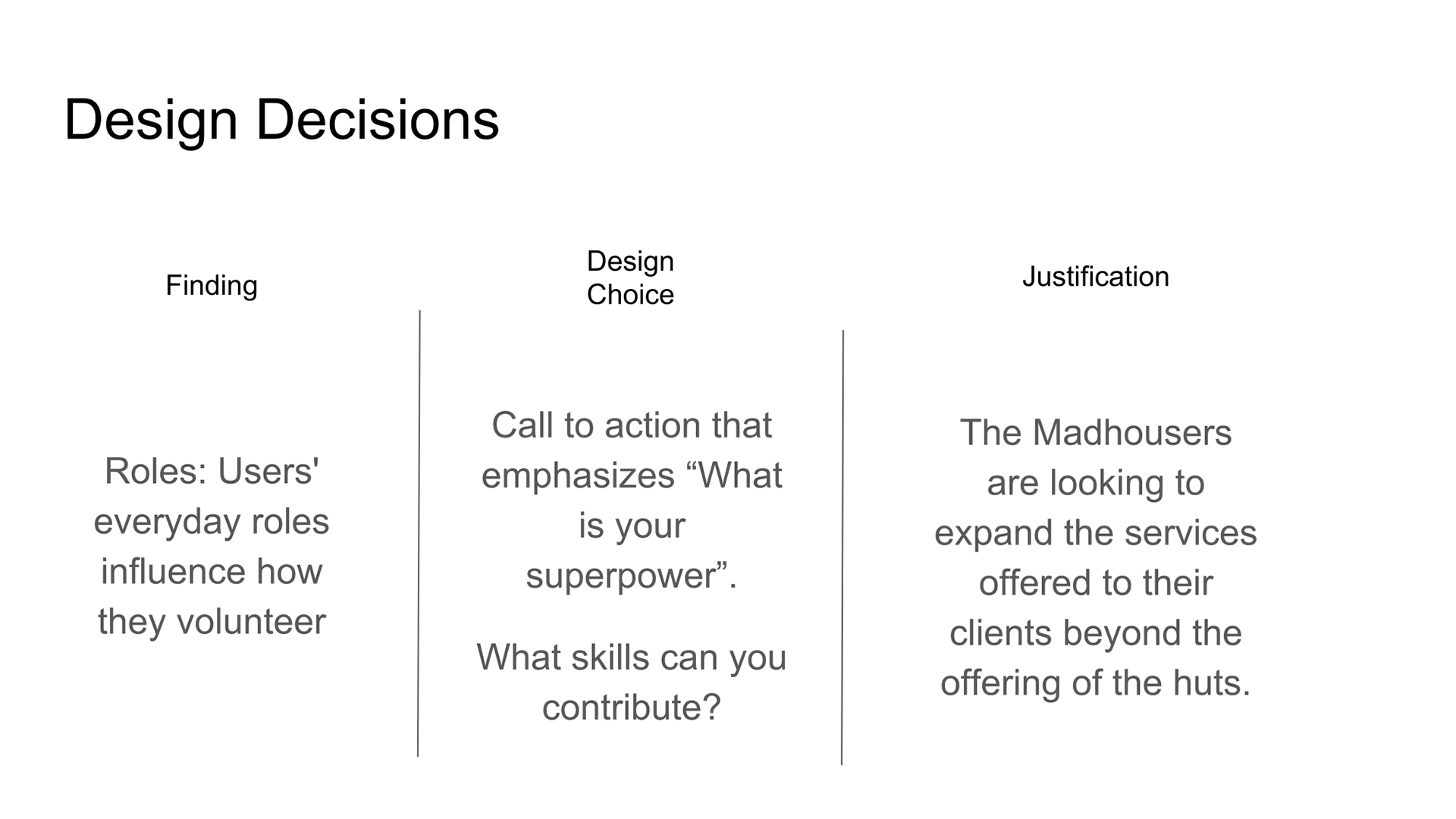
Within the final call to action include include reference to how a variety of professionals can contribute regardless of the skills essentially saying "What is you superpower? Can you build a budget, a resume, Know first aid, "
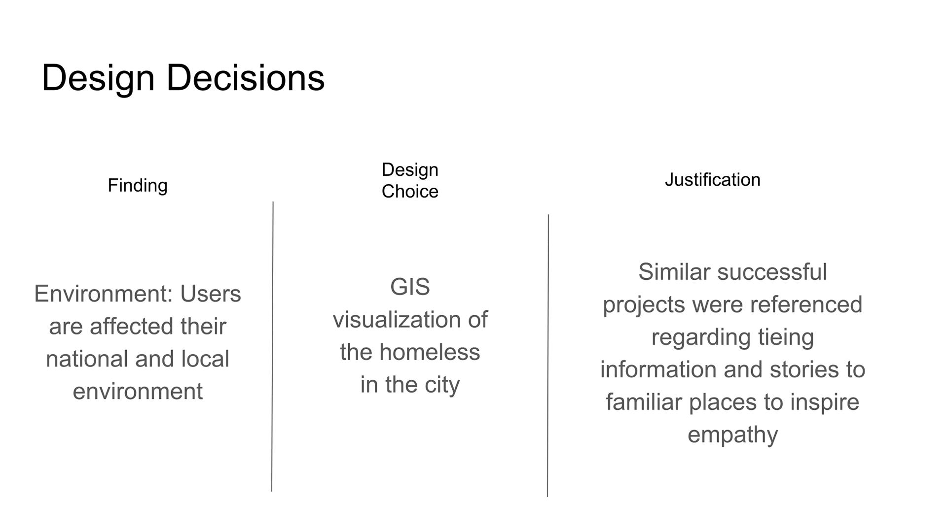
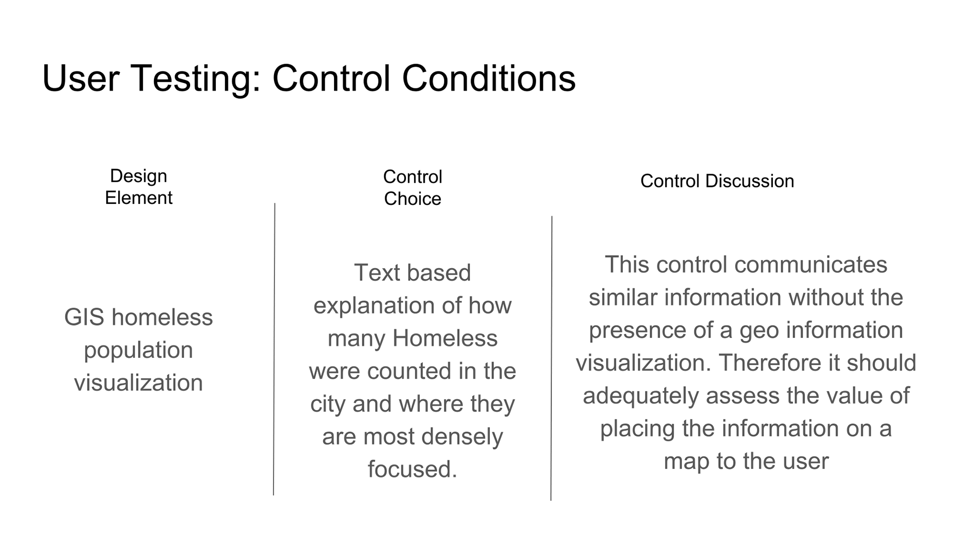
If people are influenced by their environments, showing where the homeless are in their city and neighborhoods will inspire introspection.
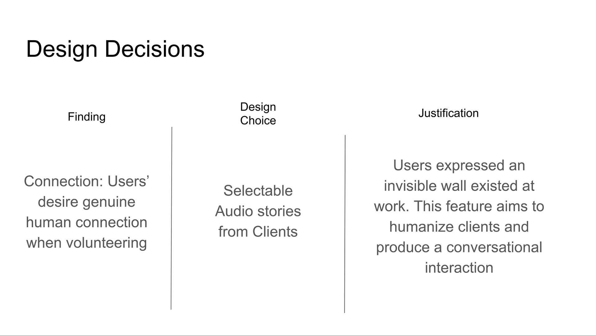
Include audio stories from clients of the Mad Housers, They should communicate the client’s journey and how the Mad Housers have helped them.
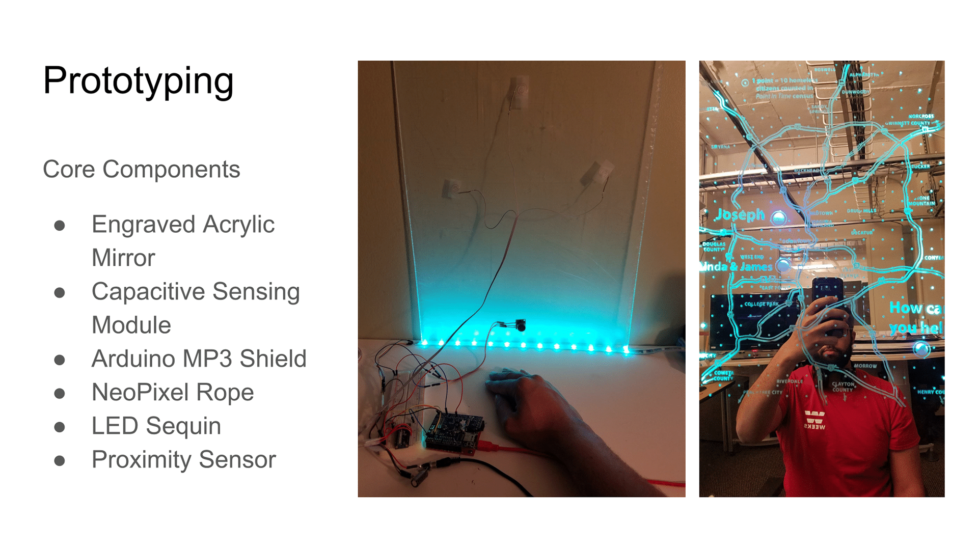
The base of the prototype is an acrylic mirror. A GIS design mapping the homeless census data of the city was design in Photoshop and rare-engraved into the back of an acrylic mirror.
Using an Arduino, I was able to create capacitive sensors to allow users to touch the front of mirror and manipulate options on the interface. I also included a neopixel rope in order to back-light the mirror so the engraving would be highly visible. The back-light would only trigger when the user was within a certain distance.
Finally, I included a MP3 shield to the micro-controller. This would allow the touch sensors to select specific mp3 audio stories I spliced together from Clients and volunteers.
To assess how effective my design decisions were at motivating target users I had to conduct both qualitative and quantitative tests. Before proceeding, I had to establish a control condition.
My control medium would be a Prezi on an Ipad…..
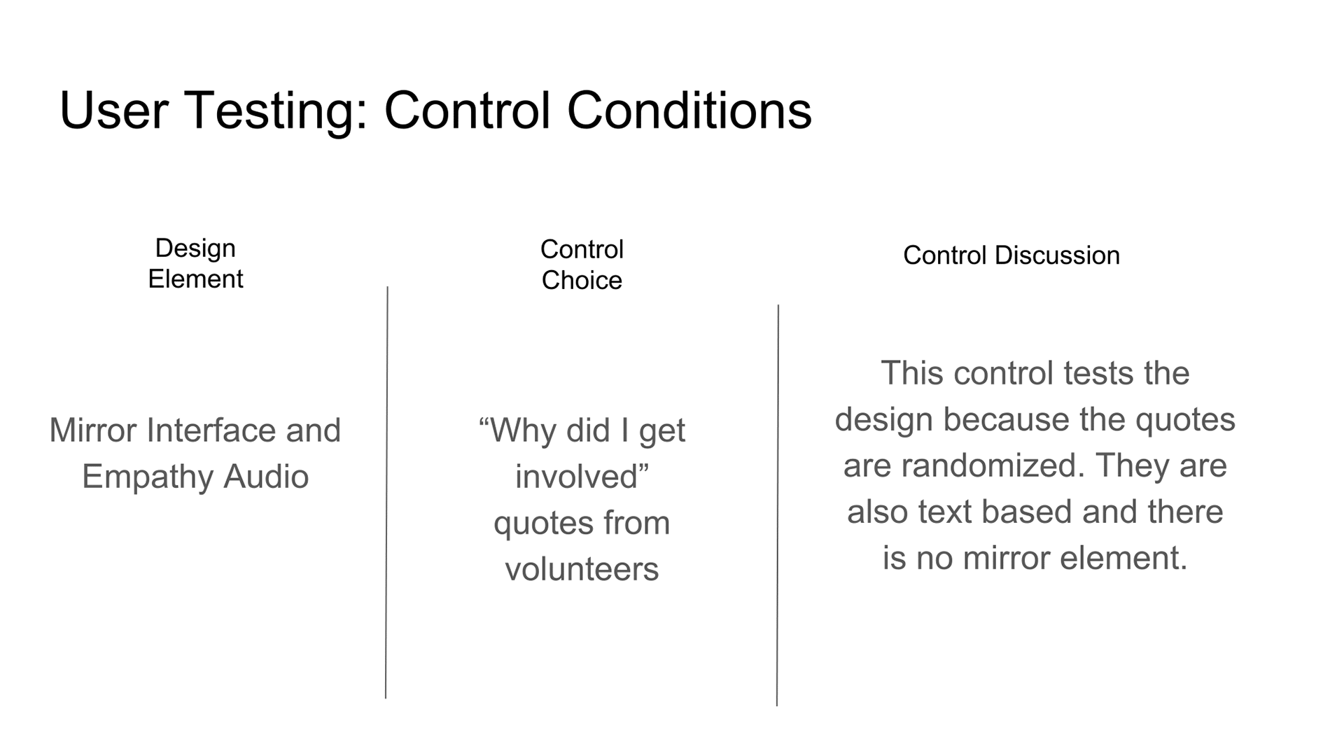
Specifically For the Mirror design element, the control would be quotes about reasons people got involved with the Mad Housers, allowing me to test my mirror design element in conjunction with audio from individuals who say the homeless are just like themselves.

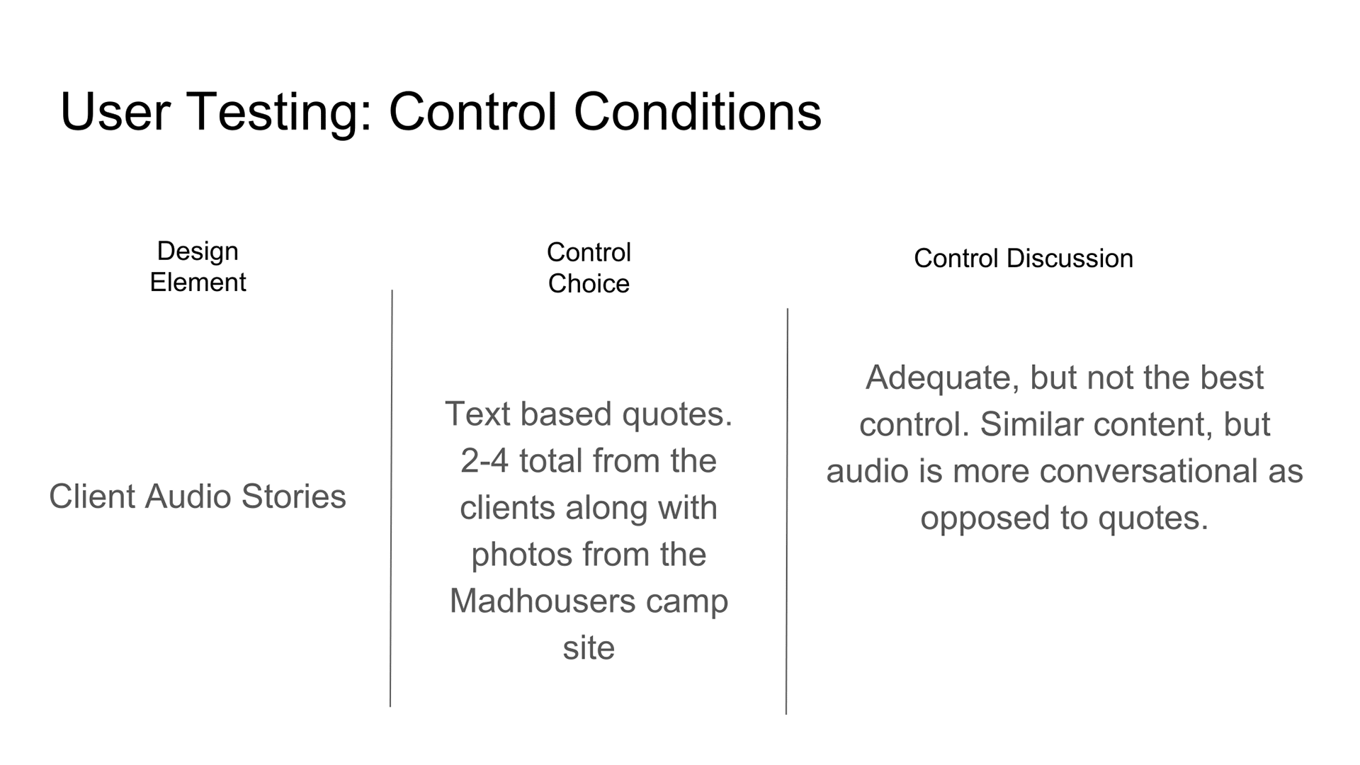
I felt the above control was not the best since the content was the crux of the design element and it was very similar between the mirror and the control. However, the mirror, having audio, was more conversational.
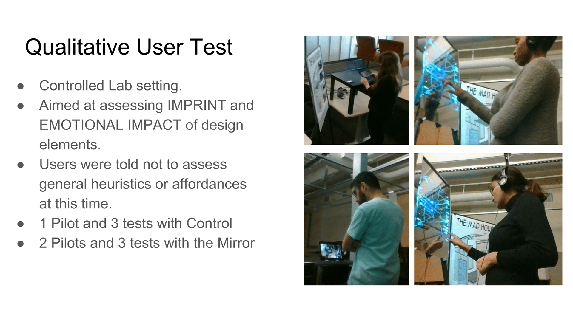
The qualitative test assessed two success metrics for my design: Imprint and Impact. To do this, I asked participants to interact with the control or mirror for at least 2-3 minutes with me not present. I gave them a brief introduction to the Mad Housers and explained the experience intended to tell their story. They could interact as long as they want as long as long as the minimum time requirement was met.
When finished, they would come get me and I would ask follow up questions related their interpretation of the experience. For each design element I asked users to tell me what they remembered about the content, what impact it had on them and to rate impactfulness on a scale from 0 to 10, where 0 meant no impact and 10 meant impact toward
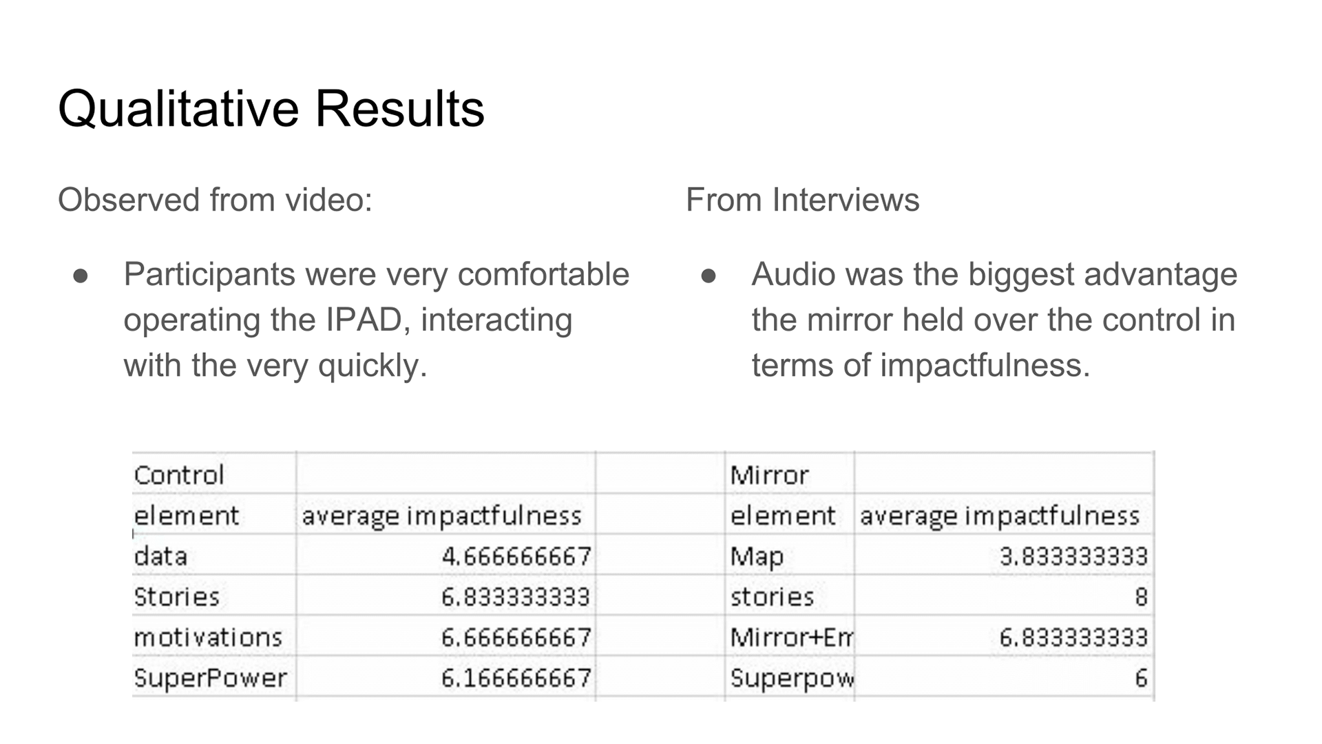
From observing the video, participants were very comfortable operating the IPAD, interacting with the very quickly and naturally. The range of length of interaction with the control was between 2 and 5 minutes. However, with the mirror, subjects were noticeably slower to interact and curious of the features. Taking time to assess the features, try new things, look at the pattern, or just listen to the audio.
Homeless Map
The design imprinted more on users than the information presented in the control. However, the map received a lower average impact rating than the control. This was due to users feeling ambivalent towards a map having no direct relevance to them.
Client Audio Stories
Regarding the Client Stories: These trended well in both the control and the mirror experience. Individuals really connected with the stories and photos and retention of information was pretty high for both the control and mirror. The impact ratings were higher for the mirror due to the longer stories and the conversational atmosphere of audio. However, presence of pictures were noted as a high point in the control.
what is your super power
As suspected, results were pretty similar between the mirror and control for the “What is your superpower” element. To note, individuals felt the call to action was incomplete without some ability to sign up immediately.
EMPATHY MIRROR
Retention in the empathy mirror element was actually higher in the control test. I believe this was due to the fact there was much less content because users in both the control and mirror tests users often cited the same impactful quotes. Impact trended about the same for both, with only one of 3 users citing the self-reflection aspect of the mirror as very impactful.

The Quantitative test was conducted mainly to assess how the experiences would do in the field. To do this, I coordinated with the Centergy building managers in order place my control and mirror experiences in the Centergy lobby where there was significant foot traffic of professionals.
Over two days, for two hours during peak foot traffic times I recorded information from the lobby bushes. Metrics I took were number of interactions, length of interaction, and type of interaction. I also intended to record sign ups so I included small sign up slips and a box with both the control and the mirror experience.
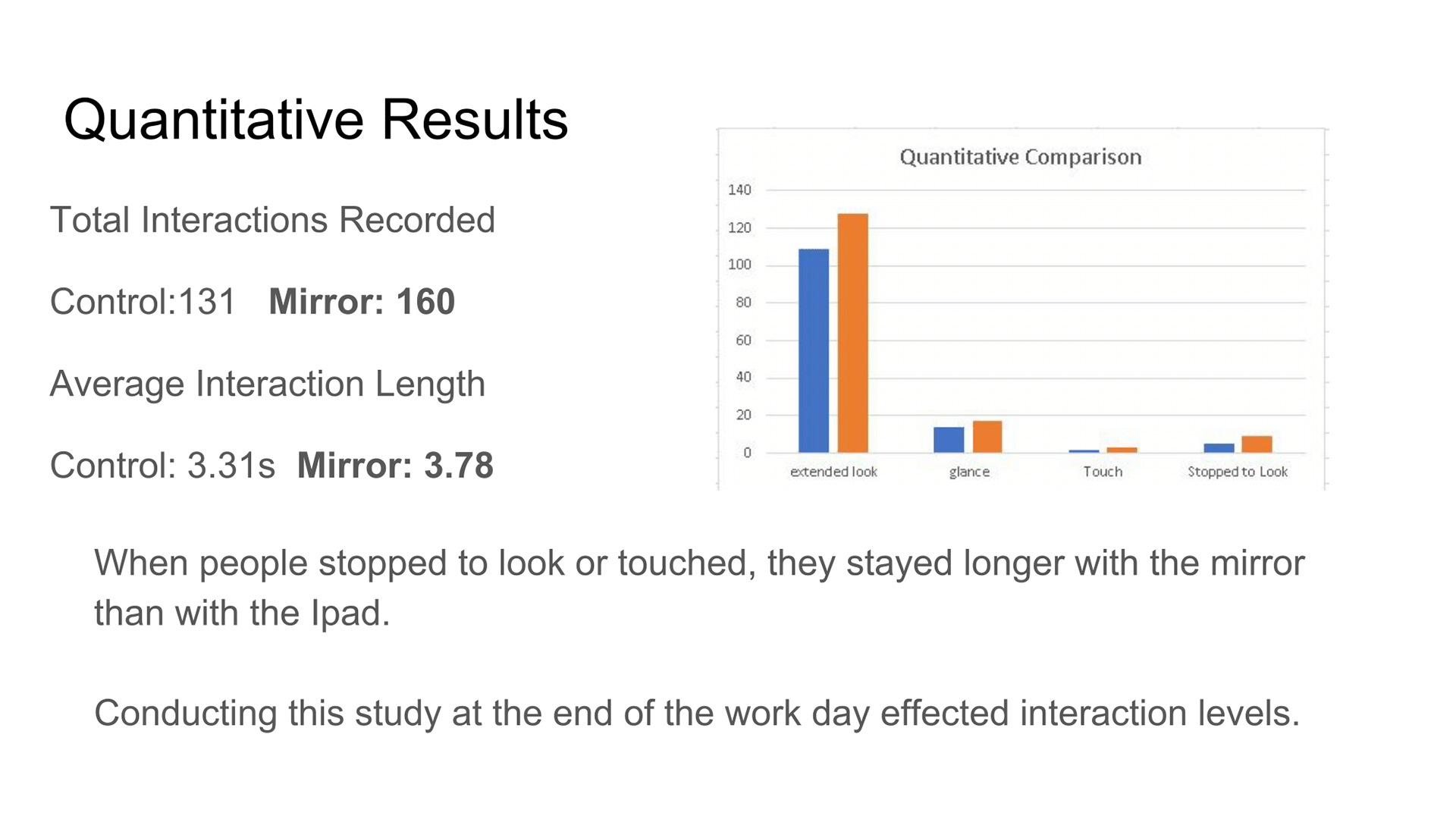
As you can see, this study did not yield great results. Most people simply walked by both the control and mirror experience. My hypothesis is that the time I conducted this study, when people were leaving work, played against its success. However, there were some findings of note. More people spent longer times interacting with the mirror, in terms of both passing by and looking and actually interacting with the mirror.
RESULTS
There were several clear conclusions I was able to draw from the results of the research with respect to my original research Goal. I set up to test 4 design choices for info-experiences with respect to my inspired action of promoting awareness of the Mad Housers.
From testing, the use of a medium of a mirror element and the GIS map proved much more effective as an aesthetic attractors of initial interaction that their intended design goals. Users thought the light up effect was clean and beautiful but at the current level of testing, it was not shown that the map’s goal of creating location based empathy or the mirrors purpose for self reflection were met. However, it was proved that audio stories, particularly from clients, were the more effective portion of the design. In fact, in both the control and mirror design, stories related to clients proved to be more impactful to users.
The value of the audio stories was also visible during the testing as the audio length kept users engrossed much longer that its still photo and text based counterparts. In testing the audio became the center of the experience, many participants not even paying attention to the mirror after sometime. It was a personable, conversational experience that met the design hypothesis and is something that should be considered when designing these experiences in the future. The call to action was called valuable in terms of addressing various helpful roles that could be fulfilled, but in appropriate control testing did not adequately assess the value of this feature.